Branding
Auth.it allows you to customize the look and feel of your login page and the emails that are sent to users. Customization options include:
- Font families for titles and text
- Border style
- Link, button, and text colors
- Background color and image
- Logo image
- Footer text for the email template
Branding is configured using a WYSIWYG editor in the Branding view in the Configuration section of the Auth.it Dashboard.
Branding the login page
When you open the Branding view, customization options for the login page are displayed by default. The branding control panel is on the right, and the preview pane is in the center.
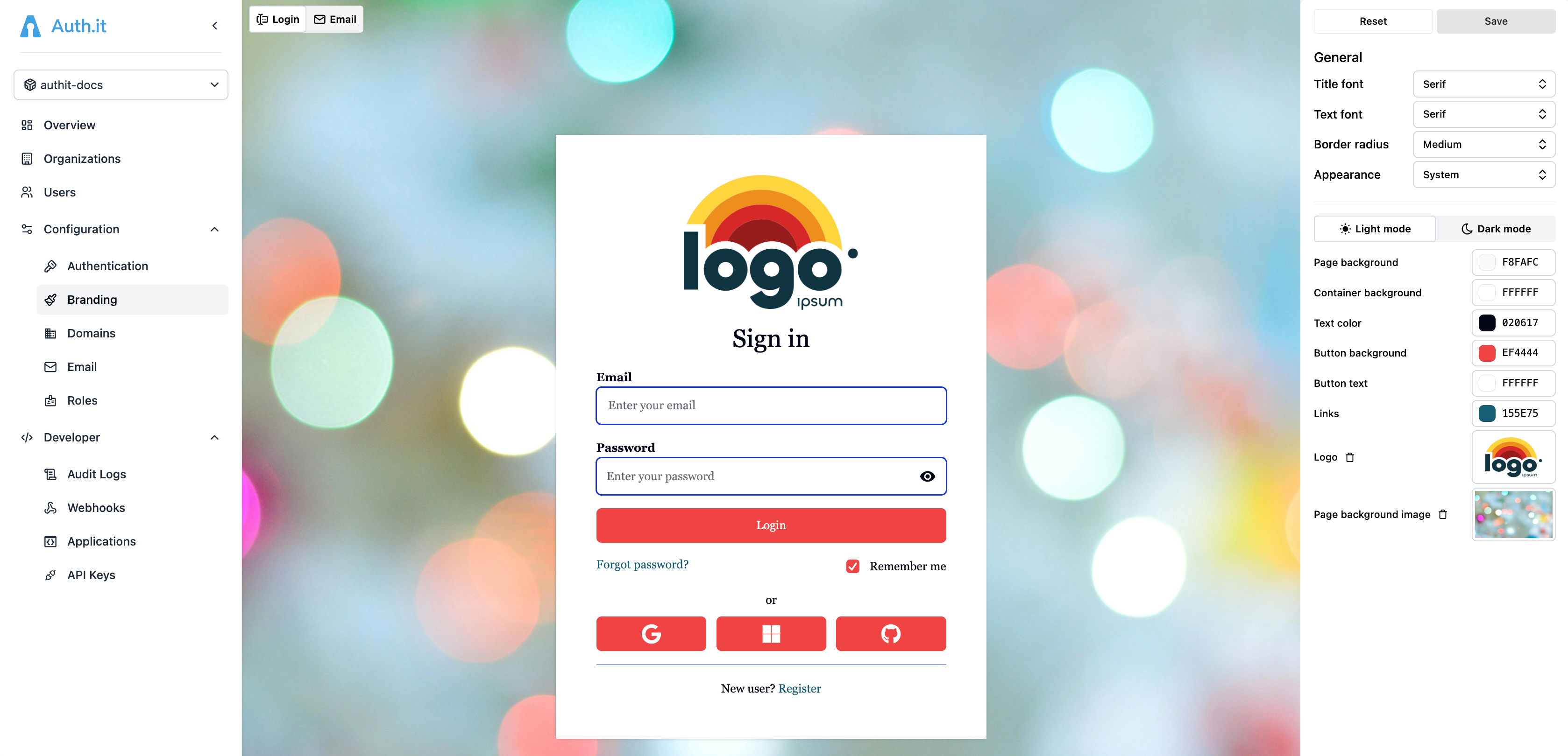
For the login page, some branding settings apply unconditionally, but most styles are defined separately for light and dark themes.
General settings
In the General section, you can configure the following:
- Title font: the font family for the “Sign in” title shown at the top of the login page’s container.
- Text font: the font family for all other text on the login page.
- Border radius: the border radius applied to the login page’s container and all elements inside the container, including input fields and buttons. Values are None, Small (
0.125rem), Medium (0.375rem), Large (0.5rem), Full (9999px).
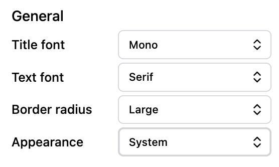
The last setting, Appearance, defines whether the login page should display differently depending on the theme selected in the user’s browser. It has the following options:
- System (default): the login page will display differently for the light or dark theme based on the user’s browser settings. If this option is selected, all theme-specific settings described below are available.
- Light: the login page will always display in light mode; theme settings in the user’s browser will be ignored. If this option is selected, only light-theme settings are available in the next section.
- Dark: the login page will always display in dark mode; theme settings in the user’s browser will be ignored. If this option is selected, only dark-theme settings are available in the next section.
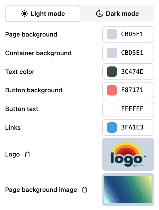
Theme-specific settings
Below the general settings, there are two tabs: Light mode and Dark mode. You can switch between them to configure login page branding separately for light and dark themes.
The preview pane in the Branding view shows a preview of your login page in the theme that is currently selected in the control panel. The actual look and feel of the login page will vary depending on the user’s browser settings or operating system settings if the browser is configured to follow them.
Both the Light mode and Dark mode tabs are available only if the Appearance setting described above is set to System. Otherwise, only one of them is available, and the switch is disabled.
Both tabs contain the same set of settings:
- Page background: the background color of the login page.
- Container background: the background color of the container that holds the login form.
- Text color: the color of text in the container, including the title, except for links and button text.
- Button background: background of all buttons in the container and the Remember me checkbox.
- Button text: foreground color of all buttons in the container, including the text and icons, and the Remember me checkbox.
- Links: link color.
- Logo: an image to be displayed at the top of the container, above the title. Maximum image size is 1 MB.
- Page background image: the background image of the login page. Maximum image size is 1 MB.
Any change you make to the login page branding for the light theme is also applied to email branding.
Branding the email template
Auth.it sends transactional emails to users for certain actions such as email verification or password resets. You can customize the style of these emails.
When you open the Branding view, customization options for the login page are displayed by default. To customize the emails instead, click the Email toggle in the top left:
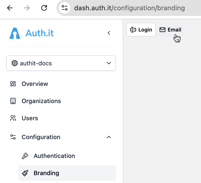
The branding control panel in the Email section contains the same settings as the login page control panel for the light theme. (The dark theme is disabled for emails because they are rendered in a single mode.)
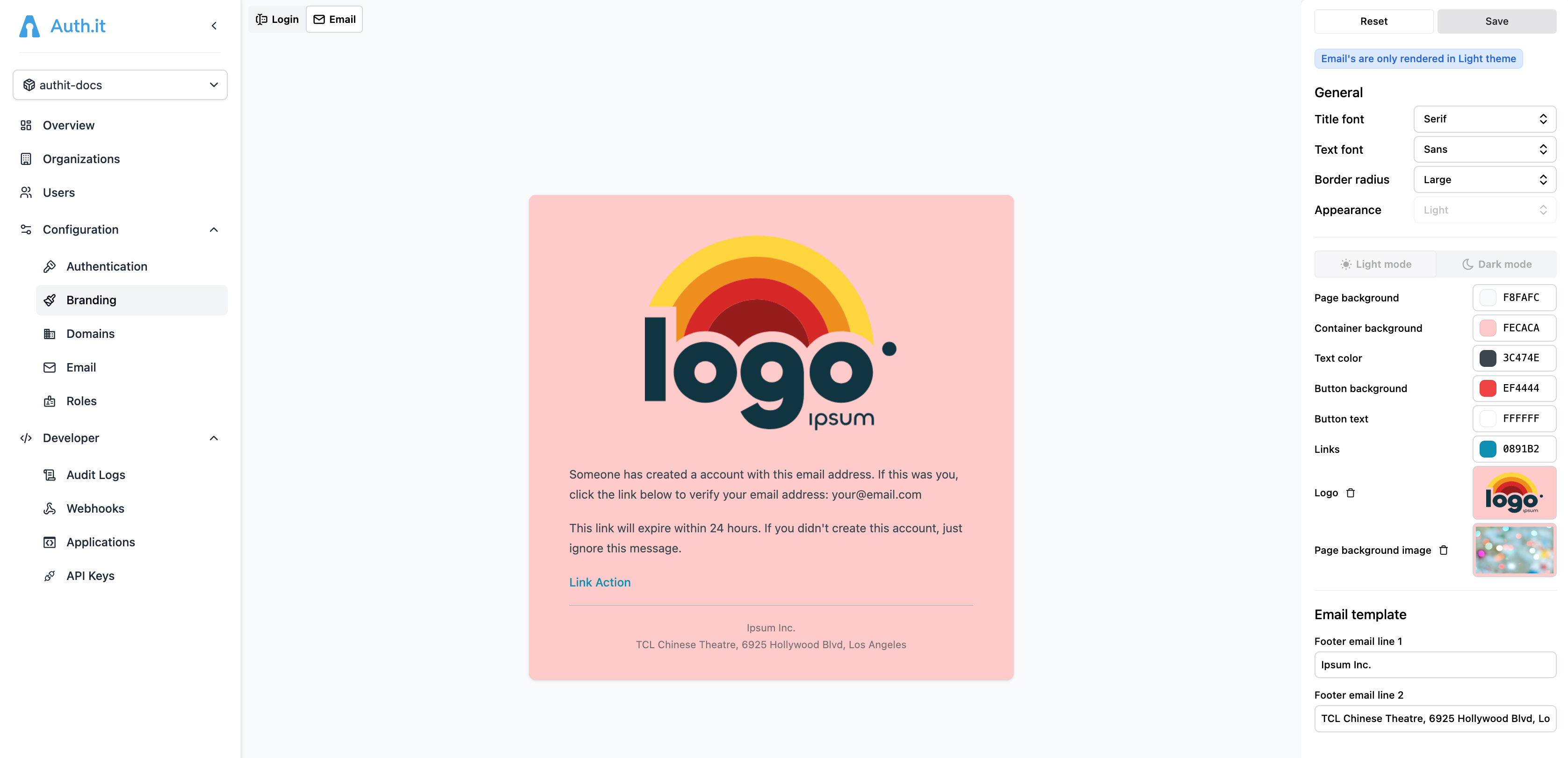
That said, some settings have a different meaning or are not applicable to the email template:
- Title font: not applicable to the email template.
- Text font: the font family for all text in the email template.
- Border radius: the border radius applied to the email template’s content container.
- Page background: the background color of the email template.
- Container background: the background color of the email template’s content container.
- Text color: the color of all text in the email template, except for links.
- Button background: not applicable to the email template.
- Button text: not applicable to the email template.
- Links: link color.
- Logo: an image to be displayed at the top of the content container. Maximum image size is 1 MB.
- Page background image: not applicable to the email template.
Note that any change you make to email branding affects the login page’s light theme branding, and vice versa.
There’s an additional section in the Email section called Email template. It contains two text fields where you can provide content (such as the company name and address) for two paragraphs in the footer section of the email. Both fields only accept text and don’t support links.
Saving or reverting changes
There are two buttons at the top of the branding control panel:
- Save saves the changes you’ve made in the current editing session and applies them to the login page and email template in production. The current editing session persists when you switch between the login and email branding views. When you try to navigate out of the Branding view, you’ll be prompted to save or revert your changes.
- Reset cancels all unsaved changes and restores the last saved branding configuration, including login page and email branding settings.